CSS Flexbox

what is flexbox?
Flexbox is a one-dimensional layout method for arranging items in rows or columns. Flexbox is a layout model that enables efficient and dynamic element arrangement. This one-dimensional layout allows elements to be placed inside a container with evenly distributed space.
flexbox properties : -
Display property:-
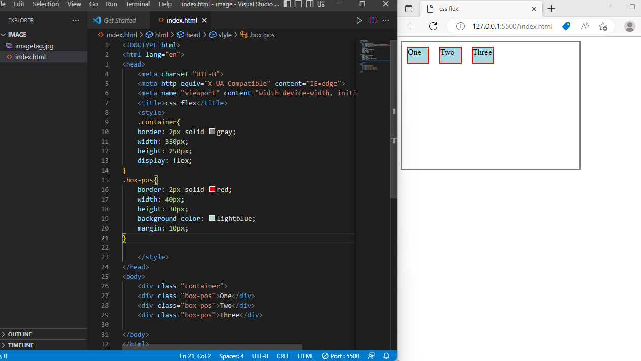
The flex container become flexible by setting the display property to flex.
Flex direction property:-
The flex-direction CSS property sets how flex items are placed in the flex container defining the main axis and the direction (normal or reversed).
in flex direction it have so many types -
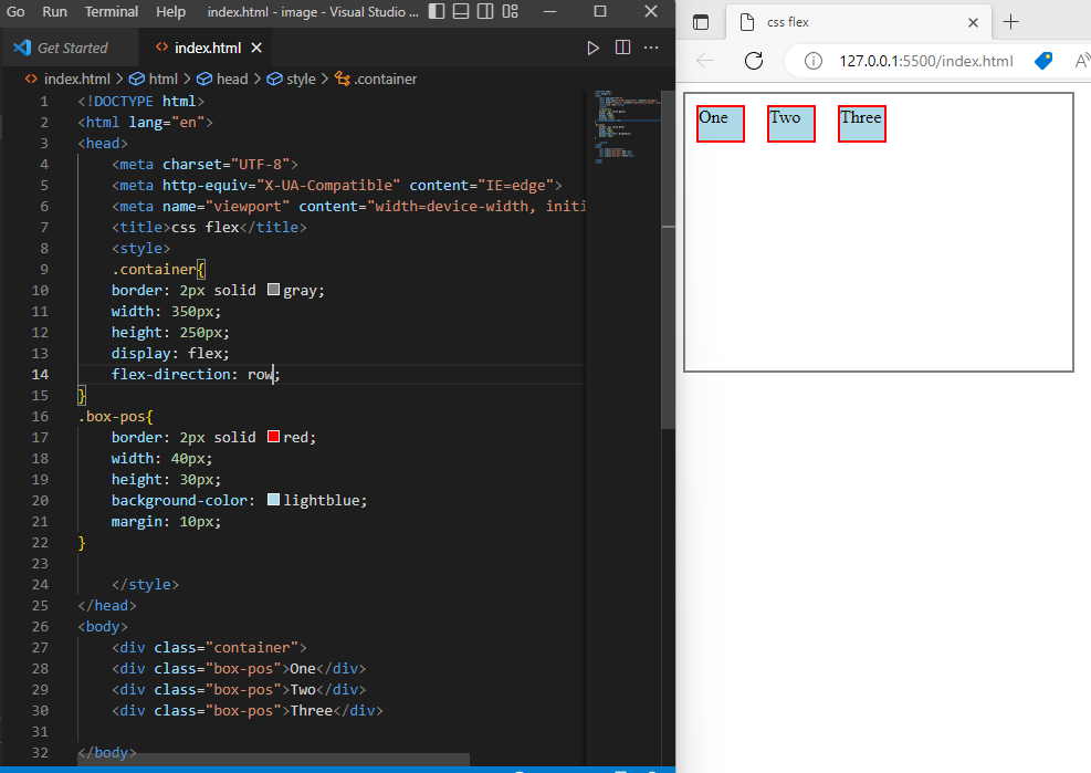
row -it represents horizantally left to right.
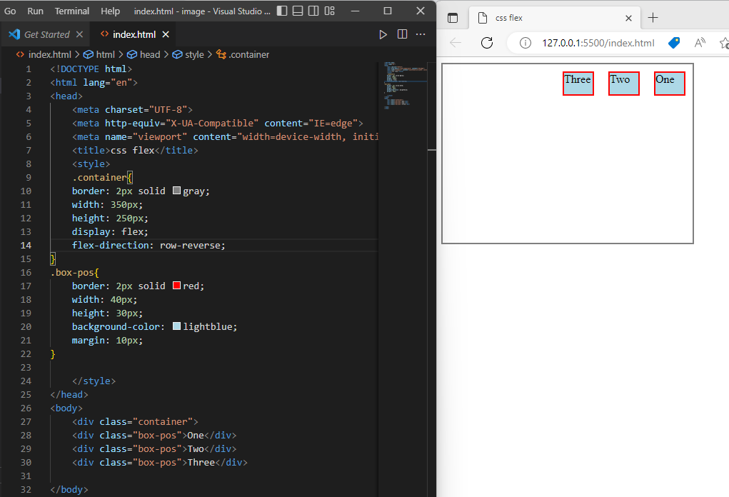
row-reverse -it represents horizontally right to the left.
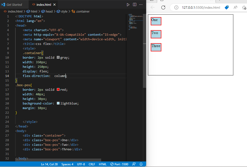
column -it represents vertically top to bottom.
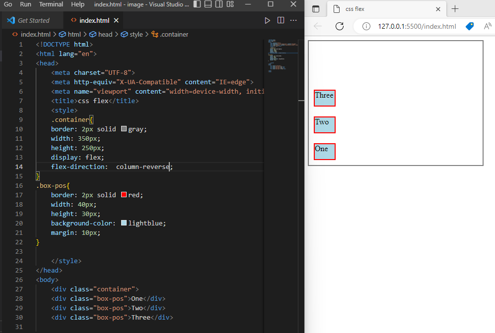
column reverse -it is also same as column but bottom to top.
flex wrap property -
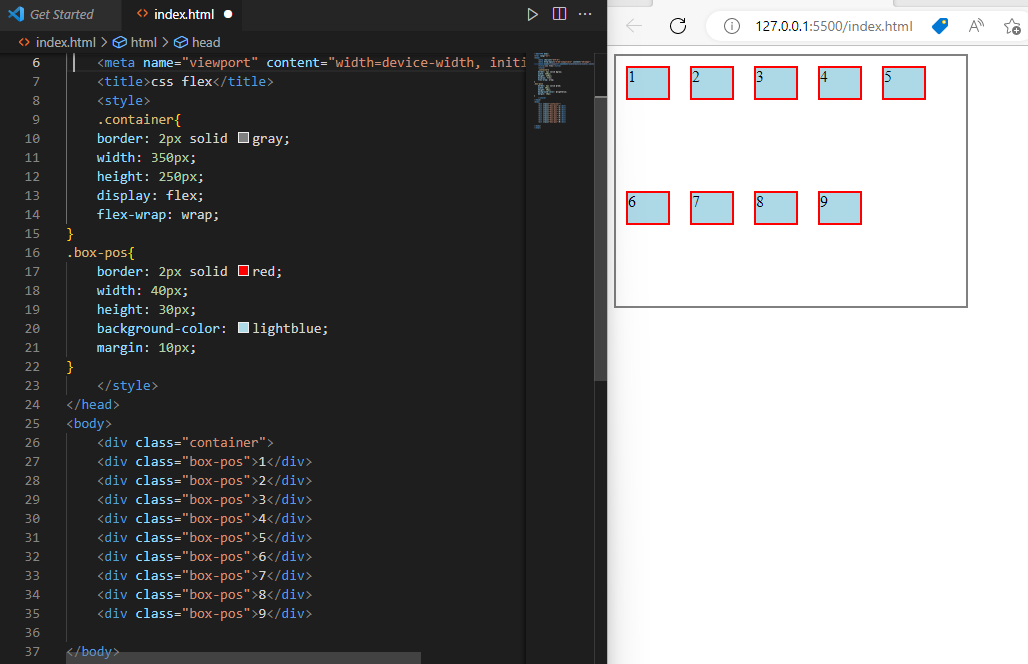
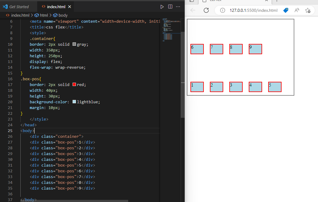
The flex-wrap CSS property sets whether flex items are forced onto one line or can wrap onto multiple lines. If wrapping is allowed, it sets the direction that lines are stacked.
wrap -whether flex items are forced onto one line or can wrap onto multiple lines.
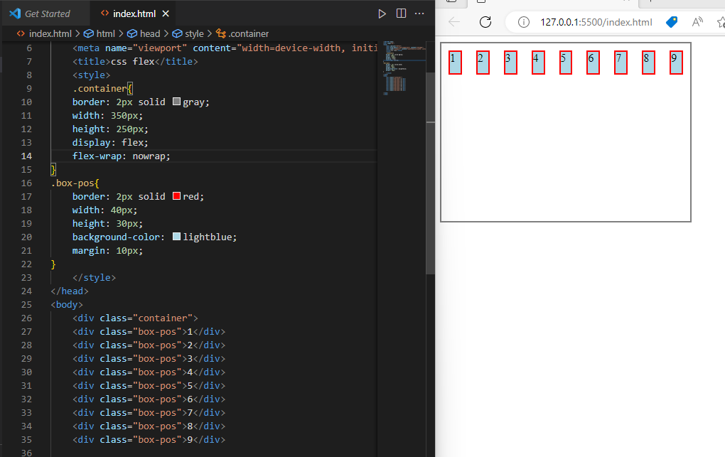
no-wrapThe No-wrap CSS property sets whether flex items are forced onto one line..
wrap-reverseit will wrap onto bottom to top
Align-item Property -
The align-item In Flexbox, it controls the alignment of items on the Cross Axis. In Grid Layout, it controls the alignment of items on the Block Axis within their grid area.
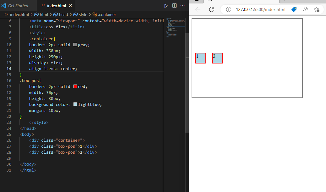
center -To center our box we use the align-items property to align our item on the cross axis.
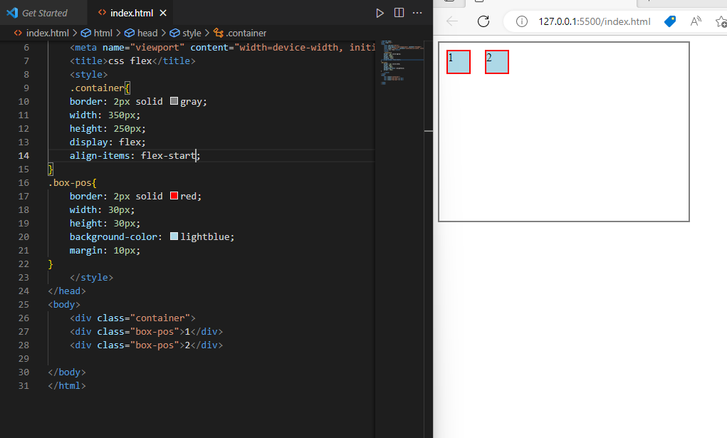
flex-startitems are placed at start of the cross-axis
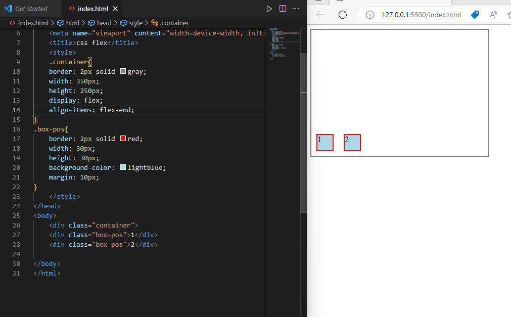
flex-enditems are placed at end of the cross-axis
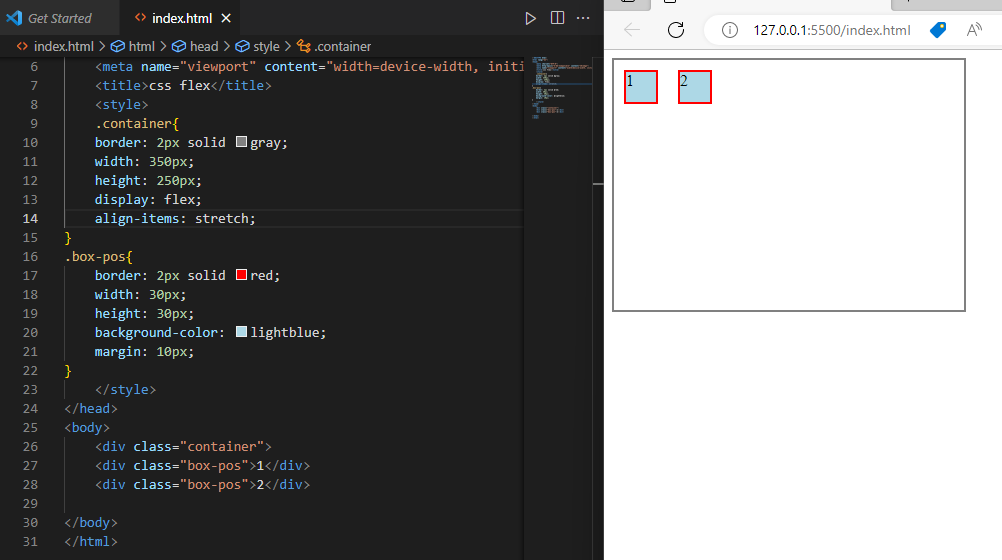
stretchcontroll all items in the cross-axis
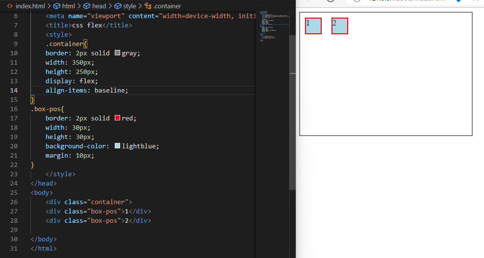
baselineitems are aligned such as their baselines align
justify-content
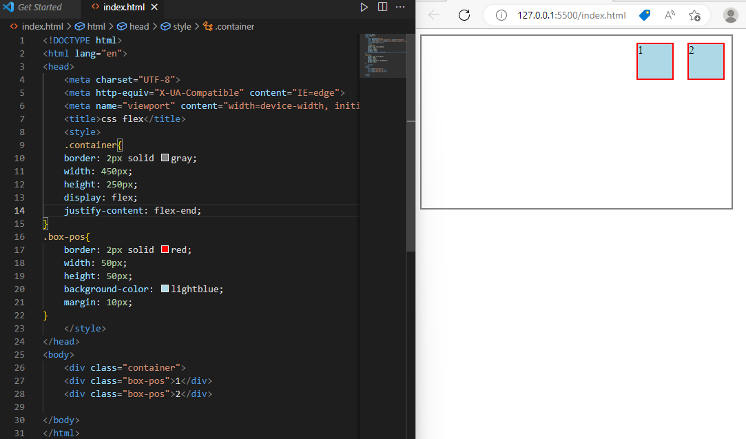
The justify-content property is a sub-property of the Flexible Box Layout module. It defines the alignment along the main axis.
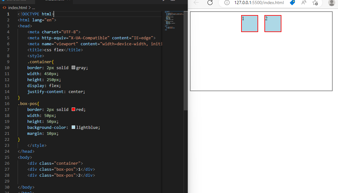
center -it centered the items in main-axis
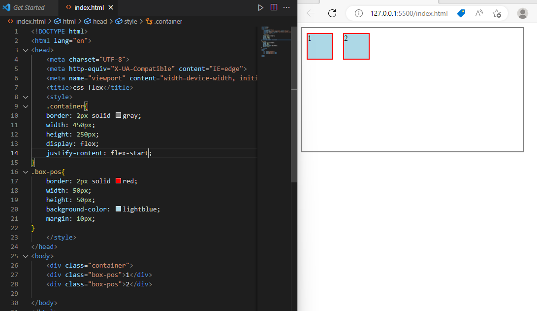
flex-startitems are moved towards start line.
flex-enditems are moved towards end line.
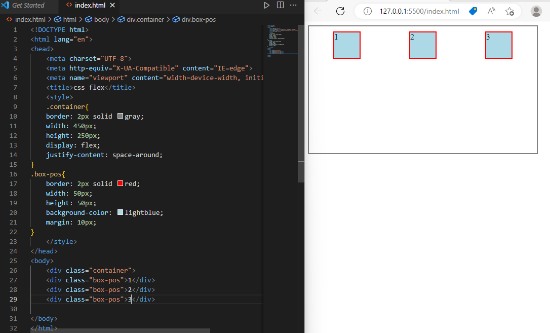
space-aroundspace-around places items with space distributed evenly around the start and end of the list.
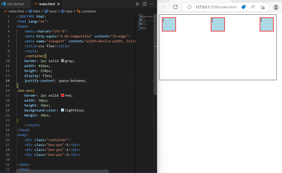
space-between
space-between evenly distributes space items between the first item is set at the start of the container, and the last item is set at the end.